A few years ago (has it been that long already?) my little sister came to me because she was getting ready to build her dream home. She and her husband had bought some family land with great views of the valley and rolling mountains behind them.
Dream homes sound fun in theory, but they also create a lot of pressure to make sure things are right.
And my sis was definitely feeling it. So she called me for help.
Their plan was an open-concept home, with the kitchen truly being the heart. She knew that she would be in the kitchen and living room 24/7 with her family, and she wanted the space to feel clean, peaceful, and beautiful while she lived, cooked, and entertained.
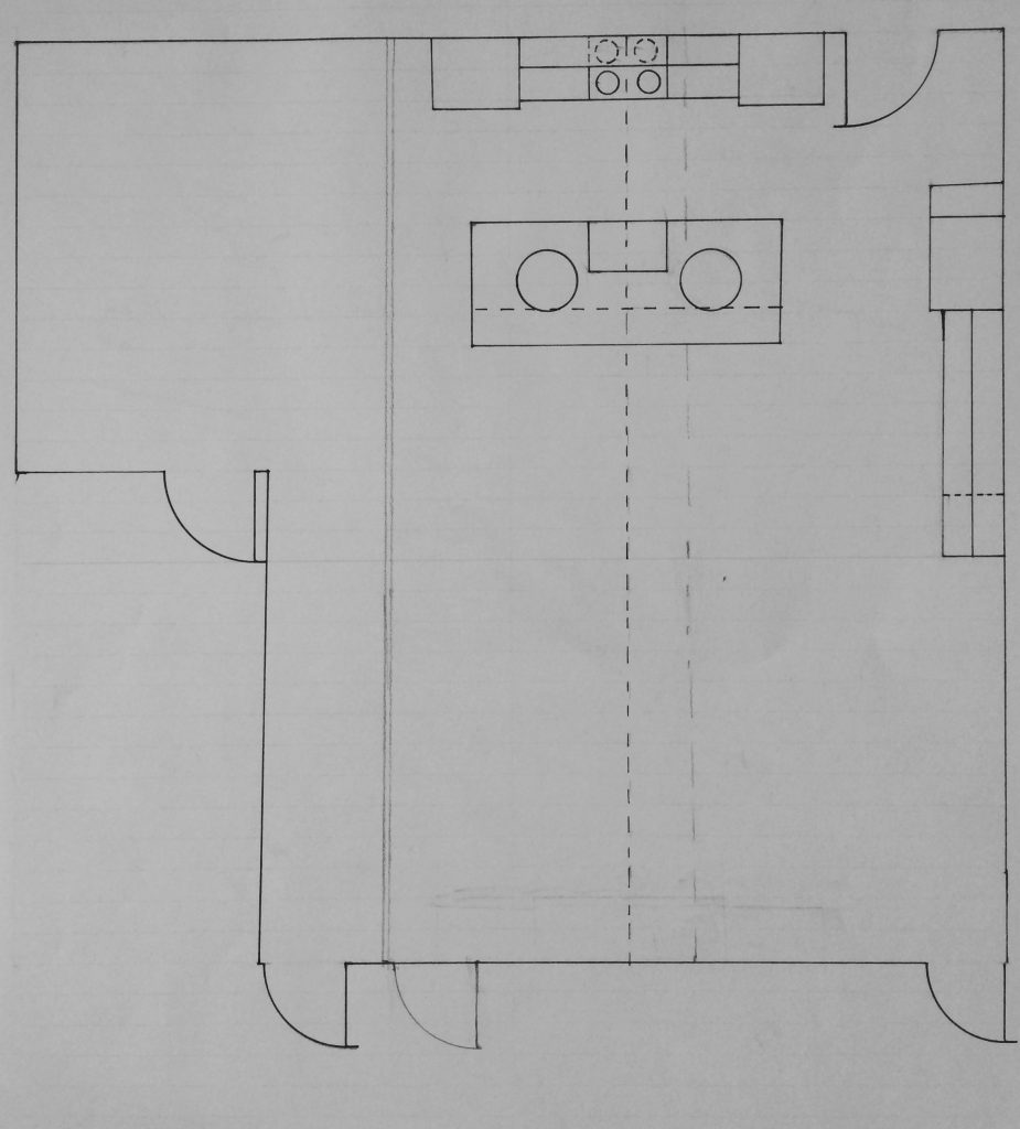
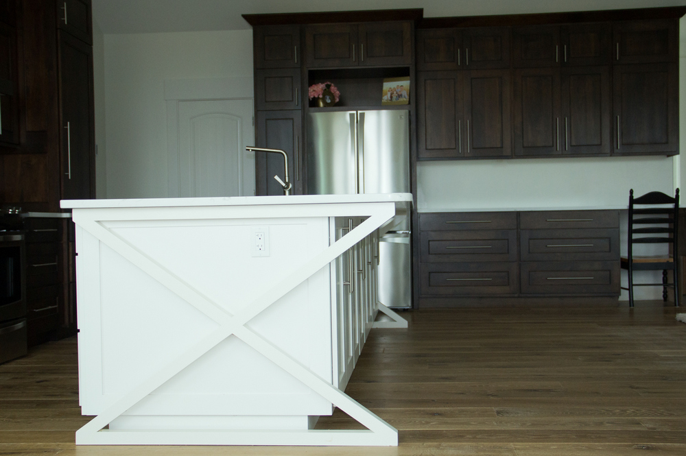
From a design standpoint, open-concept is always a challenge in and of itself. Their plan also came with one big quirk: the vault (which they wanted to keep) wouldn’t line up visually with the center of the kitchen. This meant their hood vent wouldn’t center on the vault and everything would be pushed slightly to the left.
Here is my “in process” design layout. The pencil dashed line is where the vault lies. To create a good work triangle and visually balance the space, I made the refrigerator cabinets (just below the door in the photo) extra “heavy”.
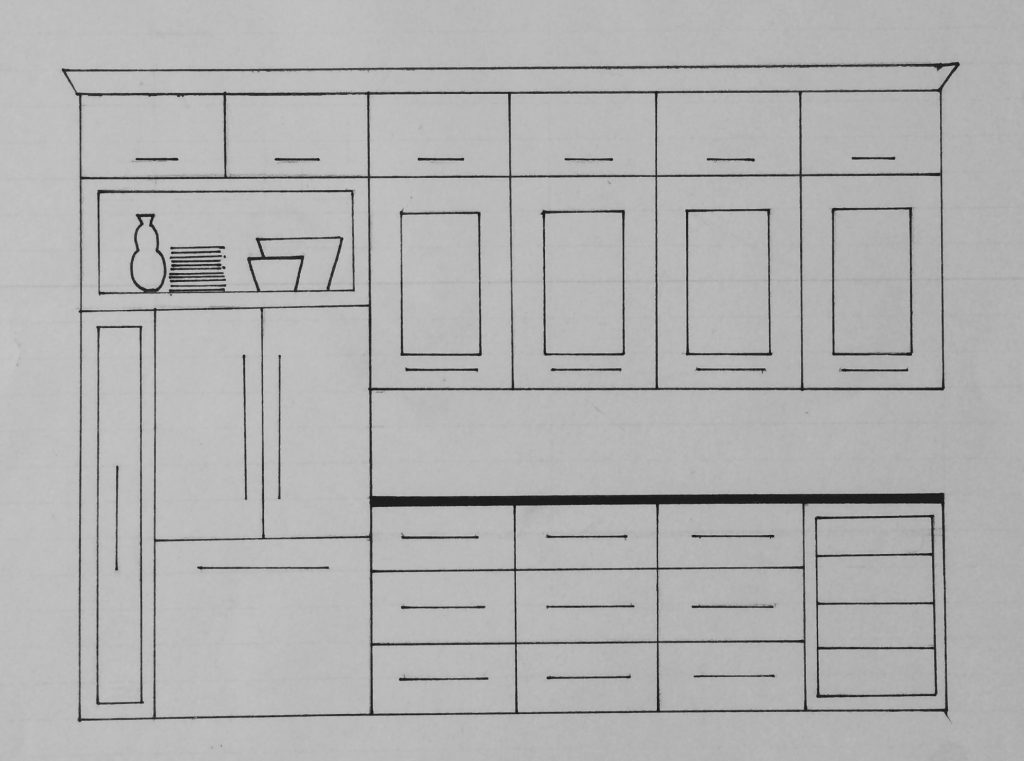
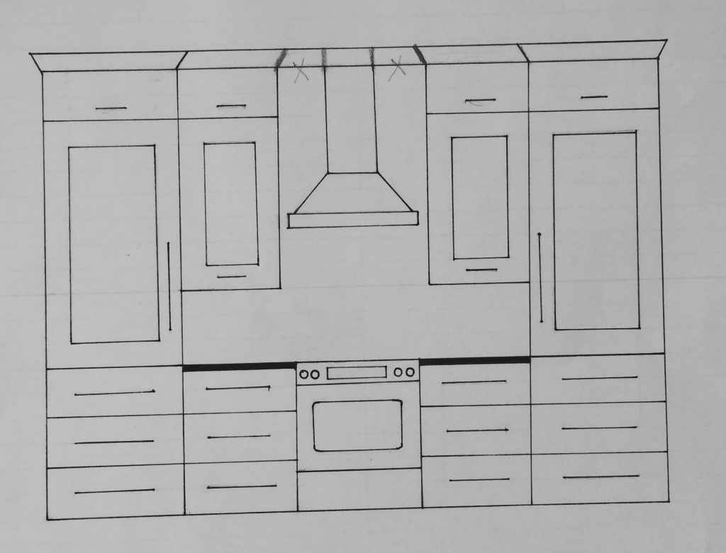
Here is an elevation drawing of the refrigerator side:
My sister was drawn to modern kitchens, so we went with large pulls for her cabinets. She also has a traditional streak in her, so we added simple crown moldings.
The thing I noticed she was drawn to the most was high contrast! She had a photo of a black and white kitchen she loved, and we almost painted the cabinets black. Ultimately, she decided black would be too high maintenance (think little kiddo fingerprints + dust…black is harder to keep clean than white). We also decided that a mix of wood and white would be more timeless, so we settled on dark walnut cabinets with a white island.
Dark walnut always has a place in my heart. It’s a beautiful wood!
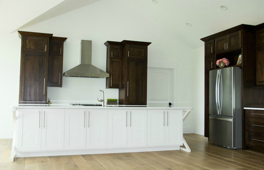
One day she’ll add a beverage fridge where the chair sits now. We maxed out the storage for her because that was a big concern.
The kitchen is open to the dining room as well. We splurged on the Arteriors chandelier to dress up the space.
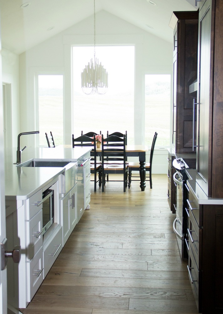
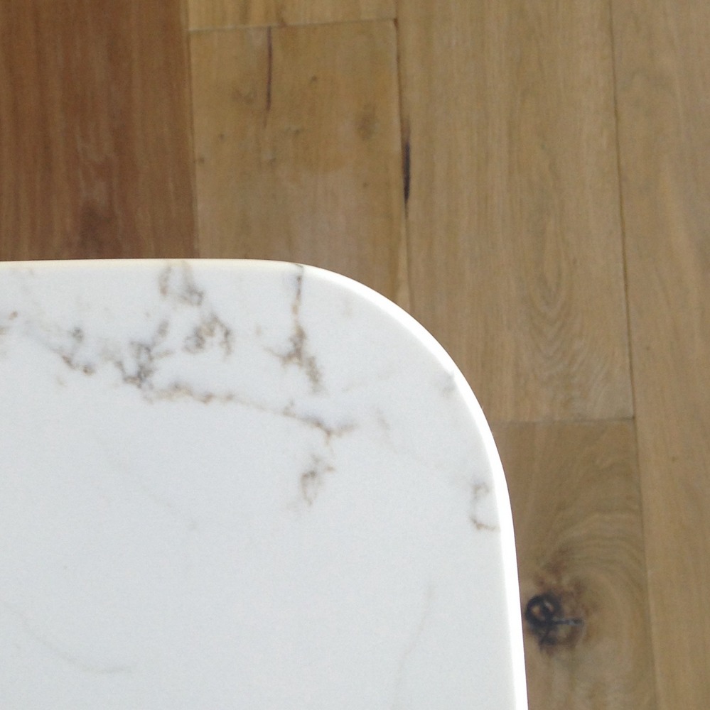
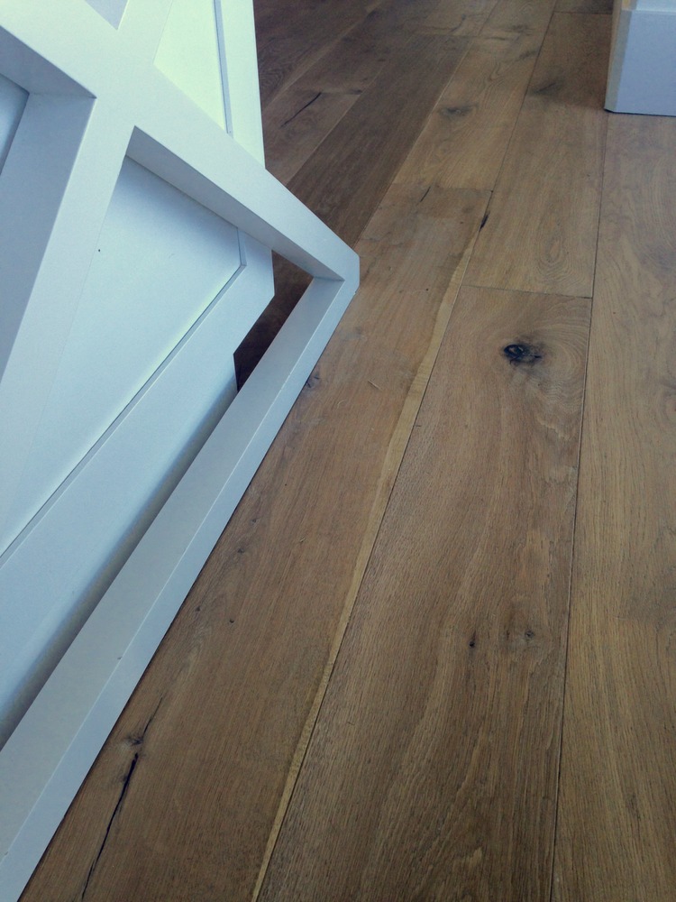
The floors are white oak. My sister was against a busy countertop, so we went with this Pental quartz. It had just enough design and warmth to hide busy-day blemishes but still keep the calm feeling she was after.
Her biggest request was the island. She had rented in many different houses before they settled down and always loved when she had an island. This is a fun detail shot of the side.
Thanks for letting me help with your kitchen, sis! It is stunning.
For those of you that are building a new home or are remodeling, I have a few tips for kitchens if you are trying to make them more timeless.
- You can’t be timeless, but you can pick things you really like.
- There are always plans that are outside the norms, but for most kitchens mix natural wood with painted cabinets. I think all-painted kitchens feel cold, and all-wood kitchens feel dated (besides rustic cabins and ultra-modern spaces).
- Put in backsplashes that are subway tile or the same countertop material. Highly designed backsplashes, bright colored glass, and anything similar are a HUGE no-no. Just don’t do it. No backsplash is a better option that a busy backsplash. (This applies to bathrooms as well).
If you need specific help with a kitchen (or any design project), I am taking new clients starting in July.
Happy Wednesday everyone!


Leave a Reply